

Why the Importance of Mobile-Friendly Websites Can’t Be Ignored
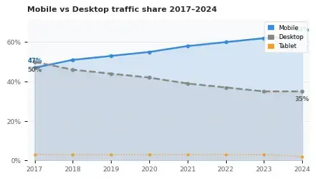
Over 63% of all web traffic now comes from mobile devices — yet millions of websites still fail to understand the importance of mobile-friendly websites, fails the most basic mobile usability tests.
In this guide, discover why mobile-friendly design is mission-critical for SEO, user experience, and business growth in 2026.
1. The mobile traffic reality in 2026
Mobile internet usage has crossed a tipping point from which there is no return. Whether your audience is browsing during a commute, shopping on a lunch break, or researching before bed — they are doing it on their phones. Ignoring this reality is the single most costly mistake a website owner can make today.
2. Google's mobile-first indexing: what it means for you
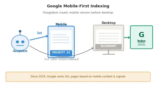
Since 2019, Google has used mobile-first indexing as its default crawling and ranking approach. This means Google’s crawler primarily looks at the mobile version of your website when deciding how to rank your pages — not the desktop version.
If your mobile site has missing content, broken images, blocked JavaScript, or a poor layout, Google treats your entire website as low-quality — even if the desktop version is perfect. This is a fundamental shift in how SEO works that many website owners still haven’t fully absorbed.
Lorem ipsum dolor sit amet, consectetur adipiscing elit. Ut elit tellus, luctus nec ullamcorper mattis, pulvinar dapibus leo.
Key insight: Google’s Core Web Vitals — Largest Contentful Paint (LCP), Interaction to Next Paint (INP), and Cumulative Layout Shift (CLS) — are all measured on mobile first. Poor mobile performance directly suppresses your search rankings.
3. Key features of a mobile-friendly website
A truly mobile-friendly website is more than just “it looks okay on a small screen.” It is an intentional design and development approach built around how mobile users actually interact with content.
Responsive design
Responsive design uses fluid CSS grids, flexible images, and media queries to make a single codebase adapt to any screen size. Unlike outdated m-dot sites (m.yoursite.com), responsive design avoids duplicate content SEO issues and ensures consistent performance across all devices.
Touch-optimized navigation
Buttons and tap targets should be at least 48×48px according to Google’s guidelines. Links that are too small or too close together cause frustration and misclicks — and Google’s mobile usability report flags these as errors that harm rankings.
Fast page loading speed
Mobile connections are often slower than Wi-Fi. Using compressed WebP images, lazy loading, minified CSS/JS, and a CDN ensures your site loads in under 2.5 seconds — meeting Google’s LCP threshold for a “good” Core Web Vitals score.
Readable typography without zooming
Body text should be at minimum 16px. Viewport meta tags must be set correctly (width=device-width, initial-scale=1). Text that requires pinch-to-zoom is an immediate usability failure and a confirmed ranking signal.
No intrusive interstitials
Pop-ups that cover the main content on mobile have been penalized by Google since 2017. Cookie banners and sign-up overlays that are not easily dismissible on small screens hurt both rankings and user experience simultaneously.
4. Direct impact on SEO rankings

Mobile-friendliness is a confirmed Google ranking factor. Beyond mobile-first indexing, Google’s algorithms actively reward or punish websites based on several mobile-specific signals including page speed insights, Core Web Vitals scores, structured data availability on mobile, and hreflang implementation.
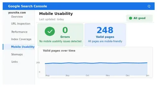
Websites that pass Google’s Mobile Usability test — found in Google Search Console — consistently rank higher for competitive keywords than those with mobile issues. The correlation is particularly strong in local search, where mobile queries dominate and Google heavily weighs proximity + usability together.
5. User experience & conversion rates
SEO rankings bring traffic — but it is the mobile user experience that converts that traffic into customers. Research by Google and Deloitte found that a 0.1-second improvement in mobile load time improves conversion rates by 8% for retail sites and 10% for travel websites.
Users who have a negative mobile experience are 62% less likely to make a purchase from that brand in the future, even if they later return on desktop. Mobile UX is therefore not just an SEO issue — it is a long-term brand equity issue.
6. Image best practices for mobile
Images are typically the largest assets on a webpage and the primary cause of slow mobile load times. A disciplined approach to mobile image optimization is non-negotiable.
- Use WebP format — 30–50% smaller than JPEG/PNG with equal or better quality
- Implement
srcsetandsizesattributes to serve appropriately-sized images per device - Always write descriptive, keyword-rich alt text (see examples in each image block above)
- Use lazy loading (
loading="lazy") for all images below the fold - Compress images to under 100KB without visible quality loss using tools like Squoosh or ShortPixel
- Specify explicit
widthandheightattributes to prevent Cumulative Layout Shift (CLS)
Alt text formula: [What is shown] + [context or action] + [keyword where natural]. Example: “Web developer testing a mobile-friendly website on a smartphone using Google’s Mobile-Friendly Test tool“
8. Mobile SEO checklist — quick wins
- Pass Google’s Mobile-Friendly Test with zero errors
- Achieve LCP under 2.5 sec, INP under 200ms, CLS under 0.1 on mobile
- All images use WebP format with descriptive alt text
- Font size minimum 16px; no horizontal scrolling required
- Tap targets minimum 48×48px with 8px spacing
- No intrusive interstitials on mobile
- Viewport meta tag correctly configured
- Structured data (Schema.org) present and valid on mobile
- Internal linking connects to at least 5 related posts
- External links to 3–5 high-authority sources (Google, web.dev, MDN)
- Google Search Console shows 0 mobile usability issues
- Canonical tags consistent between mobile and desktop versions